This is the second in a series of five blog posts about Salesforce Lightning Experience:
- What is Lightning?
- Lightning Experience Features (this post)
- Lightning Under the Hood
- Making the Move to Lightning
- Spring ’16 Release Updates
You might also be interested in our whitepaper on Dreamforce 2015 and the Winter ’16 Release.
Two years ago, Salesforce.com announced a massive overhaul of the entire Salesforce interface. Until now, the new platform—Salesforce Lightning Experience—has only been available through the Salesforce1 mobile app. But with the Winter ’16 release, Salesforce.com began rolling out the new interface—which is faster, slicker, and chock-full of new Lightning features—to the desktop as well. This is a big step in what will likely be a many years process, as Salesforce.com makes the transition to Lightning.
Lightning Features
Salesforce Lightning Experience is faster than Salesforce classic and it provides a marked improvement in the UI department. But the update to Lightning is about more than just speed and looks. Top Lightning features deliver more informative and intuitive interfaces for sales teams, including stage-based opportunities, daily task lists to help them immediately jump into their days and stay productive, and strategic dashboards to demonstrate their progress.
Stage-based Interface for Opportunities
One feature that really highlights the power of Lightning is the new stage-based interface for Opportunities, shown in Figure 1.
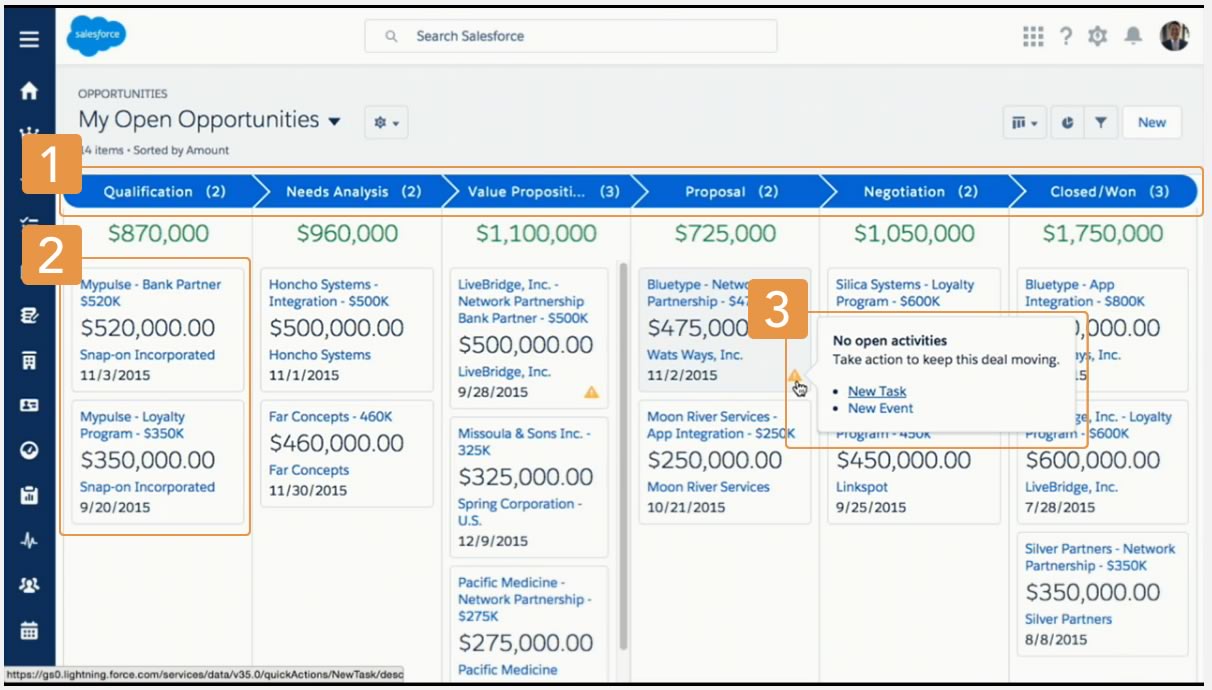
- Opportunities are sorted by stage and include the sum of the opportunities for that stage.
- Each Opportunity is represented by a card.
- Create a new Activity without navigating away from this view.
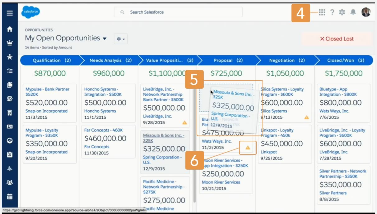
- Easily toggle between board view and grid view.
- Move an opportunity by dragging the card to the next stage.
- Alerts tell sales reps what to do to keep a deal on track.
This visual representation of the deals in progress (with alerts for those that need attention) really caught our eye. It supports drag-and-drop as well: move an opportunity from one column to the next and you’ll immediately update its stage and recalculate the totals on the screen.
My Day Interface
Another new feature we’re excited about is the My Day interface, which allows your sales team to stay focused by seeing at a glance both their results and activities for the day:
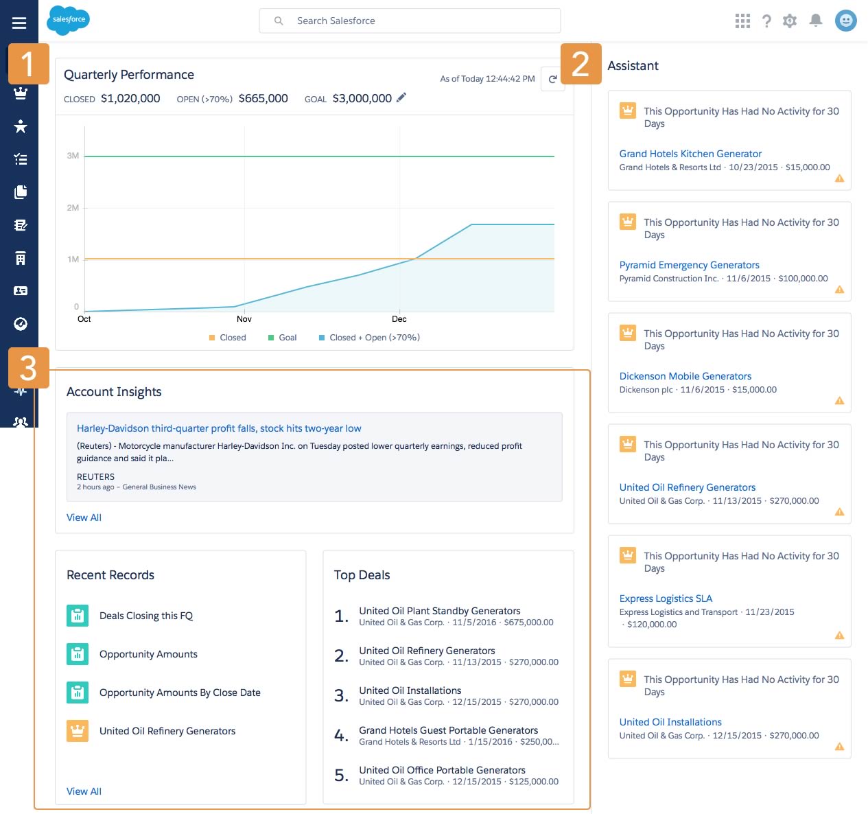
- Performance Charts – Displays a user’s sales performance.
- The Assistant – Displays relevant updates over the course of the day.
- Easily access news about accounts, recent records, and top deals.
Sales Path within Opportunities
Another new Lightning feature, pictured below, is sales path within Opportunities, which helps reps follow a standard process and focus only on data relevant to the current stage.

You establish the stages and guidance of the path and reps mark stages complete when they’re ready to move to the next one. The beauty of this Salesforce Lightning Experience feature is that reps focus on only the fields that matter most, so they qualify leads and close opportunities faster.
More Lightning Features to Check Out
Here are a few more features that caught our eyes:
Dashboards, as shown in Figure 5, are interactive and can be more easily managed.
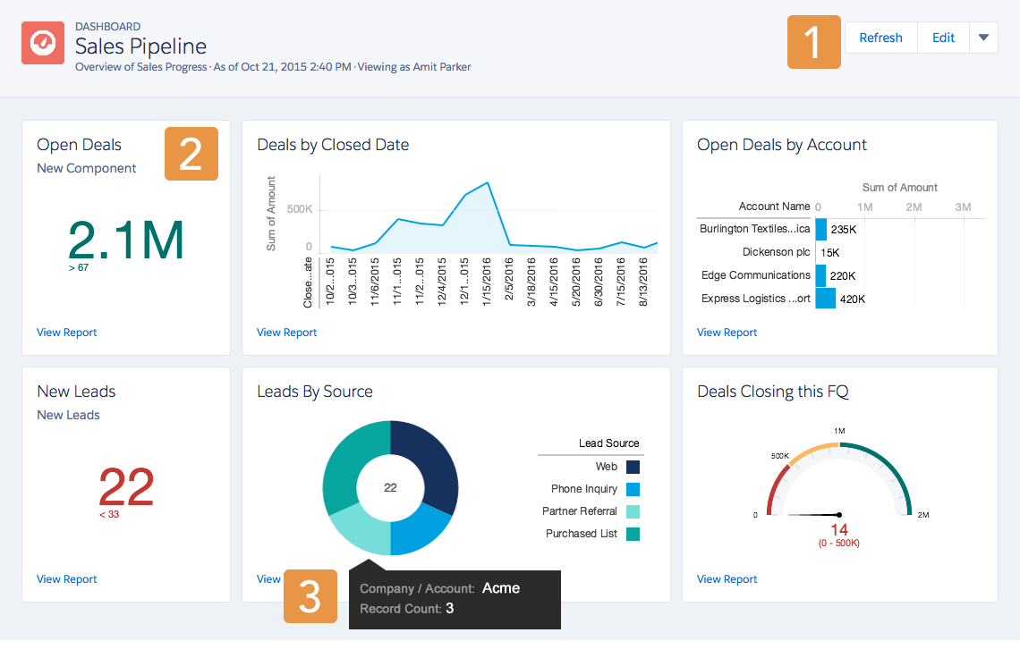
- Refresh, Edit, Clone, Save, or Delete a Dashboard.
- View a Component’s Underlying Report.
- Hover Over Charts to Learn More.
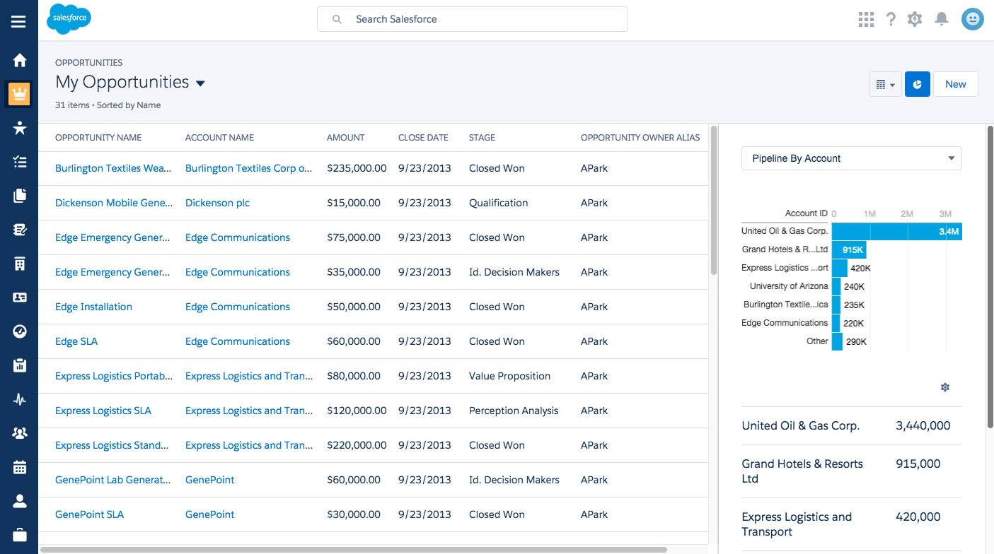
List views now support a reporting panel that slides in from the right and can aggregate data.
And, the new Note taking screen should appeal to anyone who has tried to write more than a paragraph in the old Classic interface.
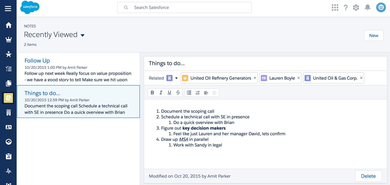
Some of the new Notes features include:
- rich text formatting (including bullet and numbered lists)
- auto-save
- standalone notes not associated with a record, and
- the ability to easily associate a note with any number of records (including those of different types).
Restrictions to Keep in Mind
But as excited as we are about these new Lightning features, there are reasons to believe that Lightning still needs some more time in the kitchen. There’s no spell check available. You can’t add private notes to individual records. And, you can’t create tasks from notes on the desktop Salesforce Lightning Experience (only on the Salesforce1 mobile app).
To learn more about the technical changes built into Lightning, check out our next post:
Implement Salesforce Lightning Experience
Are you interested in launching Lightning for your org but feel like you need a few pointers first? Our team partners with organizations to leverage the platform’s best features to make their teams more productive, efficient, and successful. Contact our team to learn more today.