As some of you have already noticed, the Campaign Member Status Chart is missing from the Campaign page. Salesforce retired this component in the Winter ’25 release. If you are like many of our clients who relied on this information, we have a very straightforward workaround you can implement today that will give you the same valuable information.
Follow my step-by-step instructions below. If you need further support, click the “Talk to a Consultant” button at the top of this page to get in touch with me and my team.
Step 1. Create a “Campaign Member by Status” Report
- Navigate to the Reports Tab: Select the Reports tab and click on New Report.
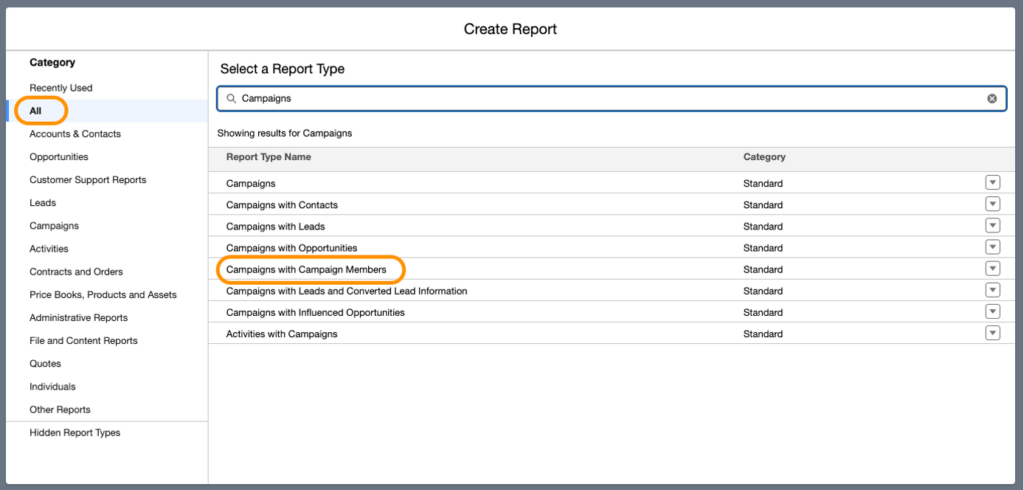
- Select the Report Type: Under the All tab, choose Campaign with Campaign Members as the report type.
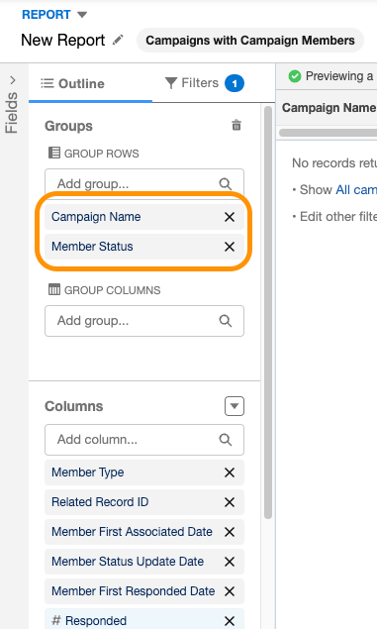
- Group and Customize the Report:
- Group the report by Member Status.
- Customize the columns to include the details most relevant to you.
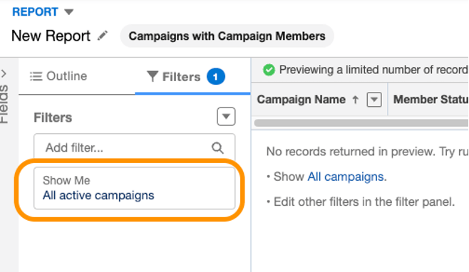
- Update filters to All Active Campaigns:
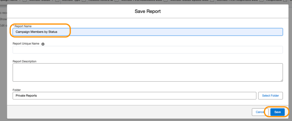
- Save and Run the Report: Name your report and save it in a public folder for easy access.
Step 2: Add a Chart to Your Report
- From the report builder screen, click on Add Chart.
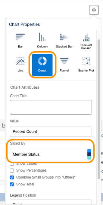
- In the Chart Settings, select a Donut Chart style and configure it to slice by Member Status.
- Save the Report after adding the chart.
Step 3: Add the Report Chart to Your Campaign Page Layout
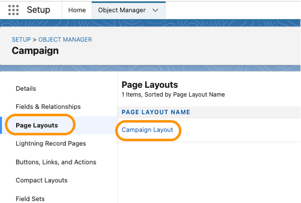
- Go to Setup and navigate to Object Manager. Locate Campaign and open the Campaign Page Layout you’d like to edit.
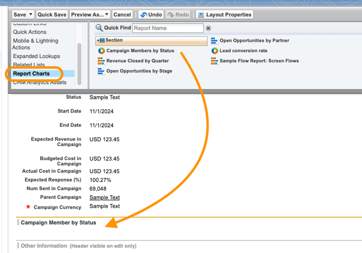
- Add a New Section: Create a new section in the layout, labeling it as desired.
- Add the Report Chart: Find Report Charts in the page layout settings and drag the newly created report into the new section.
Step 4: Adjust Chart Display Settings
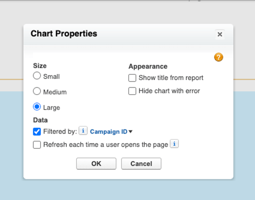
- In the report section settings, adjust the Size of your chart.
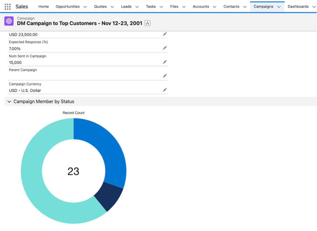
- Ensure Filtered by is set to Campaign ID. This will make sure the chart only displays data for members in the current campaign.
- Click OK, and be sure to Save the page layout.
Step 5: Review Your Setup
- Open a Campaign that has members to verify your new chart displays correctly.
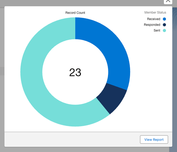
- For a detailed breakdown of statuses, click on the chart to view a more informative popup.
Optional: Add the Chart to a Lightning Record Page
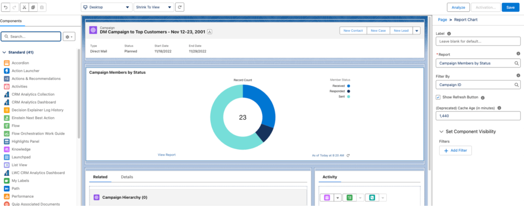
For more flexibility, you can add this report chart to the Lightning Record Page instead of the standard page layout. This allows you to position the pie chart exactly where you want on the page. The example below shows the chart displayed at the top of the Lightning page editor.
Working with Salesforce Experts to Enhance Your Org
My team and I help clients uncover ways to improve their use of Salesforce like this frequently. We also help with full implementations, org customizations, and strategic integrations. If your company wants to get the most out of the platform to meet its needs, our team of certified Salesforce experts can help. Contact us today to set up a time to speak with one of our consultants.


Thanks for the useful info! One thing to note, for Lightning, the embedded graph is grouped by the first grouping variable in the report, regardless of what parameters you set for the chart withi the report. (From https://help.salesforce.com/s/articleView?id=sf.reports_embed_limits.htm&type=5, “In Lightning Experience, embedded report charts display the source report table’s groupings, not the report chart’s. In Salesforce Classic, embedded report charts display the source report chart’s grouping, not the report table’s groupings.”) So for Lightening, just remove the grouping by Campaign Name and it works great : )
That’s a great point. Thank you!
This is very helpful! Thanks. However, unless the user is a System Administrator they can’t see the chart in Salesforce. I cannot control permissions on the Campaign Member Status object to give my marketing manager permissions even though they have full Pardot permissions. Did you run into this same issue?
Hi Linda! If they are not able to see the chart, I would double check a few things:
– Report is stored in a folder that the marketing manager has permissions to (the root folder permissions). The quickest way to check if they have access is to share a link to the report directly with them.
– The lightning page with the chart is assigned to their profile/role/app
– Marketing User checkbox is checked on their user record (this gives them access to the campaigns)
– Campaign Member is an object you can grant them permissions to if needed.