Button Bars
FileMaker 14 introduced Button Bars, which are basically layout objects that consist of segments that you can define. In my experience Button Bars get used mostly for navigation menus. I’m sure we will come up with all kinds of nifty ideas for areas they can be useful in. This article’s purpose is to show you how you can use the Button Bars to show progress.
There are lots of articles out there that can give you an idea how Button Bars are used for navigation menus. I also want to mention the application example that shows a snowflake game using Button Bars from Will at Beezwax.
Progress Bars
There are many tools out there that you can use in your solution to indicate the stage of some process in FileMaker. You can use HTML and Javascript or perhaps a plug-in to show progress. While plug-ins have become seamlessly integrated with FileMaker over the years, you still can’t use them in iOS, unless you install the plug-in on the server.
Button Bar as a Progress Bar
The wise ones always tell you to use FileMaker natively as much as you can. So I try my best to follow that notion. Primarily so you will have one piece of software to manage and you can run into less trouble. This method works well on iOS, and works in portals, as well.
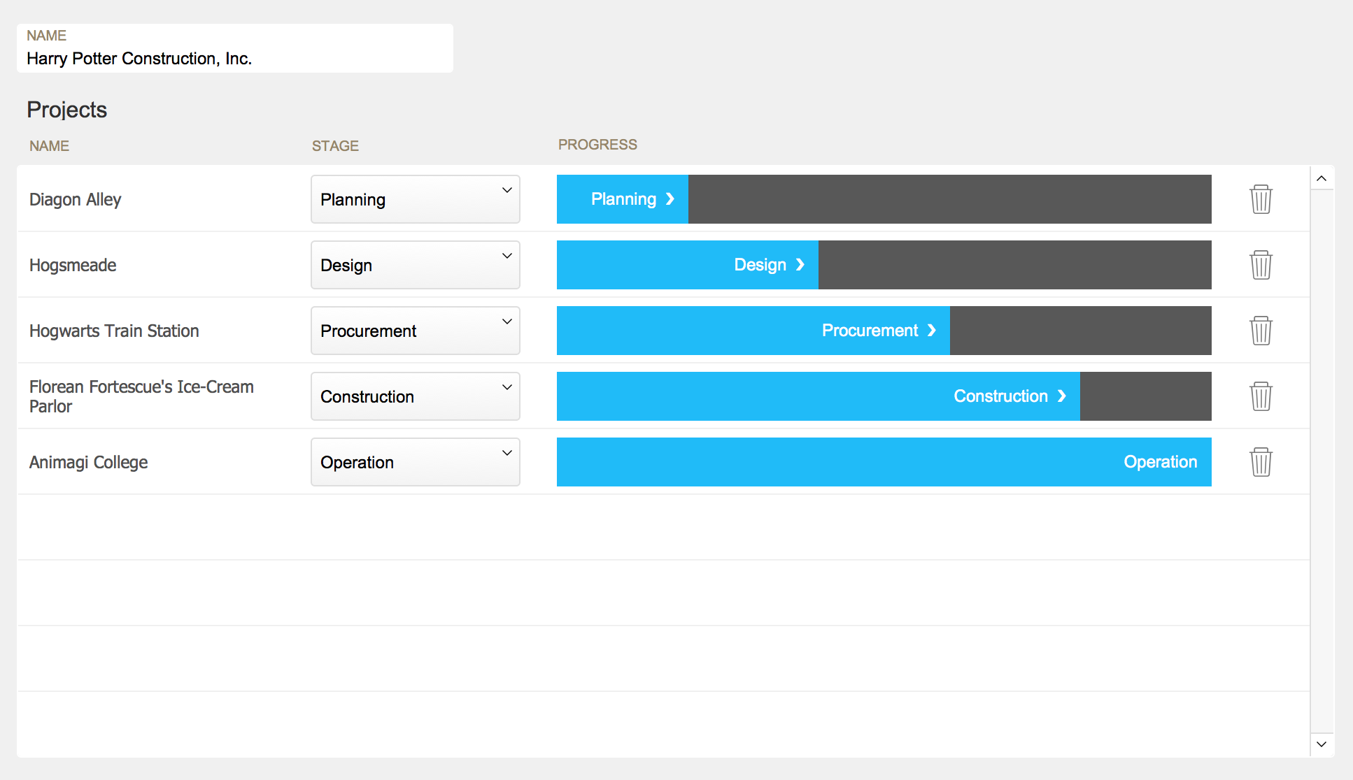
The example below shows you the stage of the projects marked with a progress bar. It gives you a nice visual indication of where each project is in its lifecycle.

You’ll see in the example file I use 20 to 100 in increments of 20, for the numbers to use to show progress. I have 5 segments in the button bar, one for each 20% reached. These numbers, of course, can be anything. If you want to go crazy, you can make it a 50-segment bar (which is the limit).
You’ll see in the example file I use 20 to 100 in increments of 20, for the numbers to use to show progress. I have 5 segments in the button bar, one for each 20% reached. These numbers, of course, can be anything. If you want to go crazy, you can make it a 50-segment bar (which is the limit).

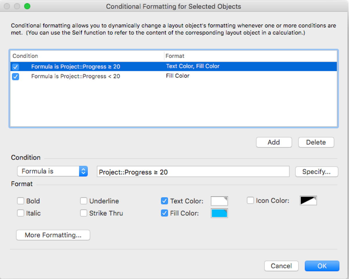
Each of the segments have conditional formatting, which makes them “light up” when the condition has been met. And once you have visible progress, I want to see where the end is, so that’s marked with a separate color. So I have two conditions assigned to them with two colors.
The first button has these conditional formatting conditions:

The rest of them are similar, only the math changes a bit to account for the progress.
The button is named with the following calculation:
Case ( Project::Progress = 20 ; Project::Stage & ” ” & Char ( “10095” ) ; “” )I also wanted to add an arrow, so I’ve used the Char() function to show an arrow character of my choice with an ASCII code.
Demo File
Download the demo so you can look under hood to see how this works in real life.
Watch our videos for more FileMaker tips and techniques:
if you make the button bar segments the darker colour you don’t need the second conditional formatting command…
Great, John! Thank you.
Pingback: RESTfm, Button Bar as Progress Bar - FileMakerProGurus
Thanks for the idea, Agnes! One minor correction: there can only be 50 segments in a button bar. But even at that you can represent 2% changes in progress!
Thank you, James. Good to know the limits. I’ll make the correction.
What a neat idea! Thank you for sharing.
Thank you, Howard! Glad you like it.
This is actually very simple to implement and quite gorgeous.
The only problem after implementation is that is several slows down the cycle through records in our solution. I tried first using 20 segments, and then down to 10. That helped some. Then I put it on a list view. That was a huge no go. It’s too bad because I love this idea! Any thoughts for performance work arounds?
Severely*