This year at the international event formerly known as “FileMaker DevCon,” I had the privilege and great pleasure of speaking about FileMaker interface design. In my presentation, “From Clutter to Clarity,” I took outdated interfaces from three legacy applications and demonstrated how to improve them, following a time-lapse approach inspired by Julia Child and Bob Ross. It was a lot of fun, especially at the end when I lead the audience in an impromptu singalong about the island of Nantucket.
“Why Nantucket?” you might ask. Well, one of my clients, Lee Real Estate, has been in business there since 1987. A couple of years ago I helped to redesign their FileMaker-based vacation rental management application. They were kind enough to let me include it in my presentation. If you’re ever planning a Nantucket vacation, be sure to look them up. They have some stunning properties!

When I first conceived of my session, I imagined that I would present work I’d done in the past, showing how it looked when I started and where it finally ended up. But presenting your work at an international conference can make you see things in a new light. A harsh light. The light of judgment. The shining brilliance of your peers (and your superiors, for that matter).
In short, I found all kinds of things I wanted to improve. At first, this completely immobilized me, but eventually I turned it to my advantage. Making further improvements allowed me to watch myself at work in the moment. I could observe my dissatisfaction with something, identify the underlying problem, and describe my path toward a solution, including some of the wrong turns along the way.

I also felt pretty strongly that the session shouldn’t focus entirely on me and my way of doing things. After I talked to my friend, patriotic jogger, and favorite brainstormer Makah Encarnacao, she suggested that I invite other designers to participate. As usual, she was right on the money. Four other designers also speaking at DevCon each made the time to engage with one of my four case studies, sharing how they would approach a redesign. Their generosity completely transformed my session, increasing both its range and vision. Due to time constraints, I had to cut one of the case studies, but the speaker, Ronnie Rios, included it in his session instead, so everything worked out just perfectly (dare I say it? Almost “by design”).
Each had a different approach to FileMaker interface design. If you’d like to learn more, please check out my session materials and video (which FileMaker should release in the next few weeks):
How to Start Your FileMaker Interface Design

Jake Johnson, Angel City Data
- Simplify the interface.
- Focus the user’s attention.
- Meet the user’s expectations.
- Delight the user.
- Try using a non-FileMaker application for your visual design, such as Graphic or Illustrator.

Matt O’Dell, Capital One
- Take an inventory of your interface (objects, actions, etc.).
- Group the items in your inventory as you see fit.
- Rough out spaces in your new interface for these groups.
- Finally, fill in the spaces with the groups.
- Focus on the big picture, and work your way down the details in a series of iterations. Be sure to test your work with the user along the way.

Alexis Allen, Hyperspace Data Solutions
- Explore the underlying business process.
- Identify the users and roles involved.
- Document workflows for each role.
- Identify gaps in the workflows (and rework them).
- Restructure the interfaces to support your new understanding of the workflows.

Ronnie Rios, Claris, Inc.
- Identify the purpose of the interface.
- Visualize the user’s workflow.
- Sketch the interface, build a simple version of it, and test that with key users.
- Repeat cycles of sketch-build-test until you are confident in the result.
- Be sure to consider the context of the interface within the entire application.
When, last month, I finally got around to posting the updated session materials, true to form, I found lots more to improve in my FileMaker integration design work. With one notable exception, I resisted the temptation to tweak things further. That exception addressed a deficiency in the booking interface for Lee Real Estate that I discussed in my talk but hadn’t solved completely. Since you won’t see this final change in my session video, I’d like to take a moment here to share it with you.
A Simple Visual Abstraction
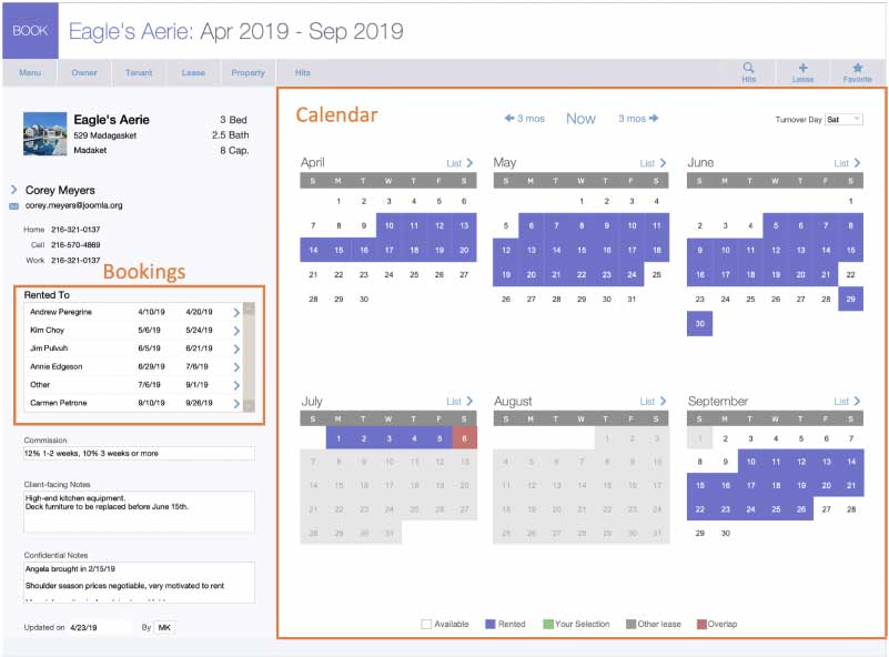
This interface shows a specific property and its bookings for a six months. A list of the bookings appears on the left-hand side of the interface; a 6-month calendar appears on the right, with the bookings color-coded.

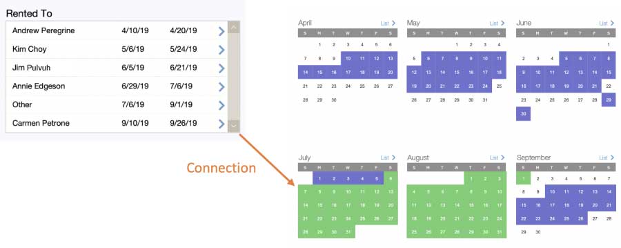
In the course of the presentation, I observed that there was no clear visual connection between the list of bookings on the left and the calendar on the right. I wanted users to be able to look at a booking listed on the left, and then be able to glance over to the calendar on the right and spot the same booking more easily. To that end, I added a button to the list which caused the same time period to be selected in the calendar (see below, selection shown in green).

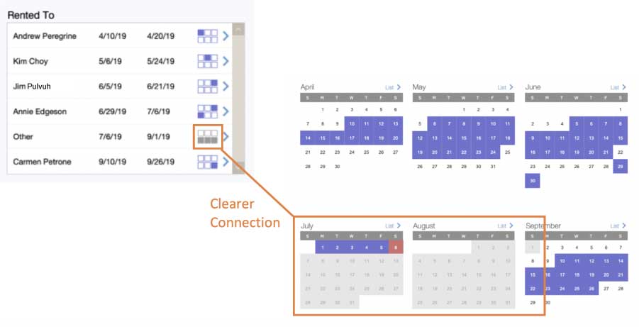
While posting the materials, I realized that in each row of the list, I could provide a simple representation of the six-month calendar for the property in question. Any month containing at least one day of the booking would appear as “booked” (or greyed out if the property owner marked it as unavailable). This would provide the direct visual relationship I sought.

Here’s What I Did
I wanted to have six squares corresponding to the six months displayed on the calendar. I decided to use text rather than graphic objects because I thought this would render more quickly. (Please feel free to comment if you disagree).
I found extended ASCII characters for a filled box and an open box. This application is used only on macOS, so I felt reasonably safe taking this approach. I used a filled box for any month where a given reservation appears, and the open box for those months where the reservation does not appear.
⬛︎  = U+2B1B  or Char(6503811035)
⬜︎  = U+2B1C or Char(6503811036)
In the first row of the booking portal, you see one filled square and five open ones:

I color-coded the text to match the two kinds of reservations shown on the calendar: blue for the bookings made by the vacation rental company and gray for the dates blocked by the owners for other purposes.
RGB(154;154;154)   //the gray used by the calendar
RGB (111;111;207)  //the blue used by the calendar
Next, I checked whether the reservation appeared in a given month. I created a custom function for this. It checks four different possible relationships between the reservation dates and the month in question. I decided it was more efficient to store the monthFirstDay and monthLastDay as global fields and pass them as parameters, rather than to recalculate them each time the function is called:
If (
	startDate <= monthFirstDay and StopDate >= monthLastDay
	or
	startDate <= monthFirstDay and stopDate >= monthFirstDay
	or
	startDate <= monthLastDay and stopDate >= monthLastDay
	or
	startDate >= monthFirstDay and stopDate <= monthLastDay;

	"⬛︎";"⬜︎"   //  Filled square if the reservation appears in the month, open square otherwise

)
Here is the resulting unstored calculation which returns the special text object. It’s somewhat expensive in terms of performance, but the portal in question typically has only 4-8 rows.
Let (
	[
	@textColor = If ( TenantLast = "Other";RGB(154;154;154); RGB (111;111;207) );
	// "Other" (i.e. owner-blocked) leases are gray while bookings are blue

	@squareSet =

		_BookedLeaseSquare ( StartDate ; StopDate ; GLB__Globals::Date_month_firstDay_u[1] ; GLB__Globals::Date_month_lastDay_u[1] ) &

		_BookedLeaseSquare ( StartDate ; StopDate ; GLB__Globals::Date_month_firstDay_u[2] ; GLB__Globals::Date_month_lastDay_u[2] ) &

		_BookedLeaseSquare ( StartDate ; StopDate ; GLB__Globals::Date_month_firstDay_u[3] ; GLB__Globals::Date_month_lastDay_u[3] ) &

		¶ &

		_BookedLeaseSquare ( StartDate ; StopDate ; GLB__Globals::Date_month_firstDay_u[4] ; GLB__Globals::Date_month_lastDay_u[4] ) &

		_BookedLeaseSquare ( StartDate ; StopDate ; GLB__Globals::Date_month_firstDay_u[5] ; GLB__Globals::Date_month_lastDay_u[5] ) &

		_BookedLeaseSquare ( StartDate ; StopDate ; GLB__Globals::Date_month_firstDay_u[6] ; GLB__Globals::Date_month_lastDay_u[6] )

	];


	TextColor(@squareSet; @textColor )

)
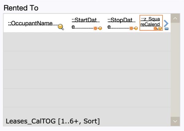
Finally, I simply included this calculated field in each portal row as follows:

Do You Have FileMaker Interface Design Suggestions?
I’m pleased with the clear relationship this establishes between the booking portal and the calendar. Do you have any other suggestions for ways to help the user see the connection between these two things? How about ideas for improving the efficiency of the code that I put together? I look forward to hearing your ideas on improved FileMaker interface design.
Next Steps for Your FileMaker Solution
Are you looking for an objective review of your FileMaker system’s interface? My team and I can give it a look and make suggestions for improvement. Contact our team to get started.
I heard only positive feedback about your session Mark. I’ll take a closer look at the article but from what I’ve read already, how very cool!
Thanks, James — I appreciate your checking out the post. Hope you’re doing well!
Mark
Thank you Don’t you have a demo?
Hi Nuri, thank you for getting in touch. I do not have a demo for this session because I was working with actual files from my clients. I was given permission to show specific interfaces in the presentation but not to share the files themselves. Cheers — Mark
Hi Mark, many thanks for the inspiring demonstration! At the end of the session you said you would provide some files that reflect what you were doing? Any chance you had a demo of the new calendar and/or how to select the dates for the booking dates? Thanks a lot!!
Hi Luis, I’m glad you enjoyed the session!
At the time, what I was comfortable including in my updated DevCon materials was Dawn’s calendar selector demo plus PDFs of a couple of scripts from my demo. The PDFs show some of the changes that I made, but I can understand that without more context they might not be that helpful. What if you and I correspond about this, and you help me get a sense of the gap between the two, and what would be useful to have filled in? Then I could write a followup blog article covering that material.
Bear in mind that I wanted to demonstrate a purely FileMaker-based calendar solution. If I were to do this from scratch, I’m pretty sure that I would use (and possibly adapt) the JavaScript calendars in Carafe, or look at 3rd party calendars from SeedCode, Paradise Partners, and other developers.
Cheers —
Mark