FileMaker 13 introduced a lot of new features. Of these, we now have Custom Themes and Styles available to us as developers.
As part of the file format change in version 12, there was some foundation put in place to make these new features possible. Version 12 introduced some built-in Themes that were said to be based in CSS, but with very limited access. In version 13, we still have similar built in themes, but also the ability to create our own, multiple styles and much more.
Is It Really CSS?
I have been a web developer for as long as I’ve been a FileMaker developer, so I tend to relate to these new features in terms that I am familiar with from my experience with other disciplines. I am familiar with CSS (Cascading Style Sheets) and how rules are inherited or “cascade”, if you will. So how similar is CSS used in web development and FileMaker’s implementation?
It is true that FileMaker handles some themes and styles in CSS. So yes, there is really CSS that is used. You don’t have to worry about learning CSS, because the interface for managing everything is part of the updated inspector (Appearance pane) that gives unprecedented access to all the formatting elements associated with parts and objects on a layout, including fields and text.
Red Triangle Gang!

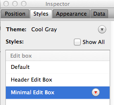
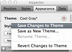
The key to understanding where the CSS formatting is being applied is in the visual indicator you get with the selected style or theme. The triangle next to the style will turn red (and show an asterisk if you’re on the appearance pane) when the style of the selected object(s) differs from that of the style or theme.
That’s important… I’ll repeat it: the Red Triangle appears if the local style differs from the currently selected style. You then have the option of saving the style, which would then apply to all objects with the same style ON THAT LAYOUT.
If you really want to optimize for performance, you will want to pay attention and avoid Red Triangles when possible, just like Batman… be like Batman!


If you do that, THEN you have the option of saving the THEME… which then applies the style to all layouts in the file.

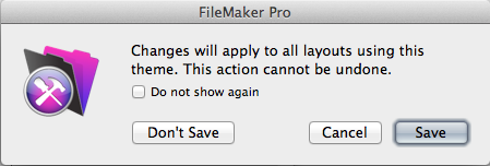
When you save changes to a Theme, you get a dialog explaining that this will apply to all layouts. And remember that if you changed any other styles, those will also be saved as well, and you will have no more red triangles!

More about Themes and Styles
A Theme is just a collection of Styles. A Style is all specified formatting that can be applied to an object, including fields, text, etc… Styles is where most of the CSS rules actually live, unless they are local to the object itself.
You see, that’s how CSS works, from the outside in… and the innermost attributes have precedence over inherited attributes. In other words, the style that is physically closest to the object will win. In FileMaker, descending from the top, outer-most referenced rules, they go:
Styles from a Theme
Styles saved to a particular Layout
Any formatting specified on an object directly, that differs from the Style
These are roughly (very roughly) analogous to CSS as used in html:
External styles
Internal styles
Inline styles
Again, this is very roughly related, so take it with a grain of salt. There are also features of CSS that there are currently no FileMaker analog for. For example, there are no media queries to handle different device sizes. FileMaker has a different approach than Responsive design, so it’s not really responsive at all, but can be just as usable in its own way.
While I love being able to have access to all this information and settings in the inspector, I find myself wanting to view the underlying CSS and even tweak it directly if needed. Perhaps that is for another version… maybe a dedicated section of the inspector? You wouldn’t necessarilly need to view the entire DOM, since the appearance pane displays where objects are getting their style from, depending on the Red Triangles.
With all the improvements to formatting options and being able to collect and organize them into themes, there’s a lot to like in this version of FileMaker. You could even think of it like a version of Photoshop you use to program with. Well, actually, more like Illustrator than Photoshop, but you get the idea. Along those lines, perhaps a Layers pallette would be useful, especially considering the new ability to conditionally hide objects on a layout.
Expect much more to be written about how Themes work and emerging methodologies for how to leverage this great new feature. There is much more to explore…
References
- Introduction to styles and themes in FileMaker Pro http://help.filemaker.com/app/answers/detail/a_id/11895/
- CSS Introduction http://www.w3schools.com/css/css_intro.asp
- CSS Media Queries http://css-tricks.com/css-media-queries/
Hey nice article! Thanks for taking the time…. Can you also comment on the import feature of themes…. Thanks Stephen G