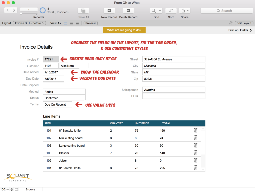
Over a week later, and I’m still on the high of speaking at FileMaker DevCon – no time travel necessary, as it’s vivid in my memory! It felt like just yesterday that I was testing my demo file on repeat, making sure that each example was ready to show on the big screen. And then came the time to stand up in front of a crowd and share things I’m passionate about: FileMaker, empathy, and interface.
My session focused on ways to get the right answers from your users, where I showed User Interface (UI) tips and tricks. The FileMaker platform is one of the best tools out there for improving and extending your business and the way you manage your data and workflow.
So why does the UI matter? Why does the experience of the user matter? Because we’ve all grumbled at bad design. Because we’ve all yelled at our screen when a website “doesn’t make sense.” Because bad UI makes for sad users. As a developer, you have the ability to make users happier people, better workers, and more productive employees.
My slides focused on some key questions to ask your users, so that you can empathize and understand what they’re dealing with. Half of the battle is understanding what they need, while the other half is figuring out what currently frustrates them (and then figuring out how to solve that). After talking to users and planning out what needs to be created or changed, the next step is to start planning out your FileMaker solution – the workflow being key.
You’ll want to make sure that whatever you build doesn’t hinder productivity, but in fact, seamlessly lets a user move and work faster. So what are some of the FileMaker tools that you can take advantage of?
FileMaker Tools for Better UI
- Theme & Styles / Object States
- Consistency is key
- Allows you to reuse a style for faster development
- Conditional Formatting
- Warn the user or draw attention to something
- Provide feedback on what a user has done
- Conditional Visibility
- Show the fields and objects that matters
- Hide functionality that isn’t useful to the user
- Buttons and Button Bars
- Consistent interface
- Allows you to use text and icons to communicate what a user can do
- These can include popovers
- Custom Dialogs
- Warn the user (more harshly than conditional formatting)
- Provide feedback
- Card Windows (My favorite!) / Popovers
- Focus the user on the right stuff
- Provide a clean and organized interface
- Consider these a potential [smarter] replacement for dropdown and pop-up menus
- Awesome for selecting related values and allowing searching
This list is just the tip of possibilities and features the FileMaker platform delivers to better navigate and control your users. Now this all comes with the caution that too much control is a bad thing. FileMaker Pro provides us with a slew of features that can benefit your users. If you have someone in the organization who is interested in learning about FileMaker Pro, you might find yourself with a power user, and that person can be a huge asset to helping you and the business succeed.
Ask Yourself the Right Questions for Better UI
Remember, FileMaker provides us with a set of tools; our job is to learn how they work and then get as creative with it as we can.
To get you started, here are a few questions to ask:
- Who is your user? (a farmer who is looking to advance his business with technology? An office worker who wishes they were still using pen and paper? A CEO who wants to streamline their business?)
- What does their job entail?
- What challenges do they face in their role?
- What are their pain points?
- What would make their job easier?
- What does the business need from that user?
- How can you add value to both your user and the business?
- Are you going to teach them how to use FileMaker Pro or how to use the app you build?
With the FileMaker platform, you have a flexible and fluid tool to help solve business problems and improve the user’s experience. By focusing your attention on the workflow and the needs of your users, you can leverage FileMaker Pro, FileMaker Go, and FileMaker WebDirect to get the right data from your users.
A quick (and overzealous) aside: I was proud of my invisible popover for my demo file. It was a way to show off what we were going to do by creating a sort of overlay on the layout. Just one more way to manipulate FileMaker Pro and to use a tool in a slightly different way.

Watch the Video
Want to learn more? You can watch my full 2017 DevCon session:
You can watch this directly on YouTube here.
If you have any questions, please feel free to do so in a comment or by contacting our team directly.
Great tutorial, thank you for sharing! How can I get the demo file of this ?
Love the video. Gives me new inspiration. But where can i get the demo file