The other afternoon (Tuesday, around teatime), my eyes were suffering a bit of screen fatigue. Previously, I’d given both Night Shift and Dark Mode cursory usage on my Apple devices. I’m not a cave-dwelling developer and work with plenty of indirect natural daylight, so I’ve never felt a strong need to try and change my usual Light Mode environment.
As macOS Dark Mode support is a new feature of Claris FileMaker Pro 19 (which means “FileMaker Pro displays in the appearance chosen in System Preferences”), I thought I’d give it a whirl.
First Step: Dark Mode
To switch to Dark Mode:
- Go to System Preferences, click General.
- For Appearance, select Dark.
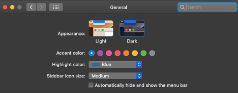
Note: macOS 10.15 Catalina also has an Auto option for Appearance.
I made a new FileMaker file from the Inventory Starter template and added some dark records.
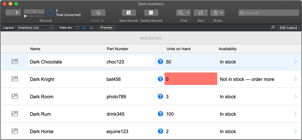

Note that FileMaker layout objects do not change when System Appearance is in Dark Mode. The Status Toolbar changes.
Right away, I saw that the color palette was going to need some work to be optimal in both Light and Dark Mode, including choices for conditional formatting and in Find mode. I suspect the use of negative space around layout objects would be even more important in dual Light and Dark Mode environments.
One option for a small app would be to design two sets of layouts, one for Light and one for Dark. Then use the Get (SystemAppearance) function to put the user on the appropriate layouts. That might involve an unacceptable trade-off in keeping those layout versions in sync.
Hiding the Status Toolbar would minimize the visual impact, though user interactions need to be controlled through menus and scripting of on-layout buttons.
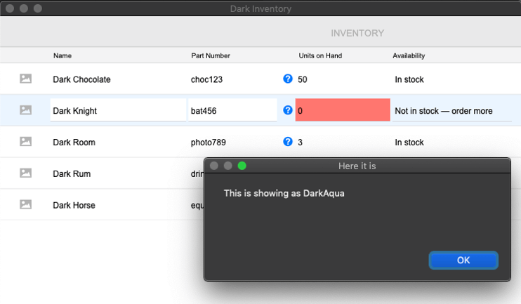
But generally, so far so good. Tooltips and Custom Dialog boxes need some attention, but I can work with that.
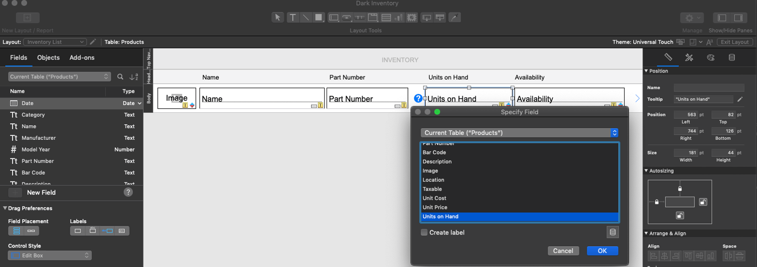
Layout mode was likewise pretty usable.
And then I opened up Script Workspace, and my eyeballs hit the proverbial skids: black font on nearly black background. I brightened the screen and could make out what looked to be black sprinkles on dark chocolate icing. The screen glare was also problematic. I was bobbing and weaving like a prizefighter, trying to read the script in between glare spots.
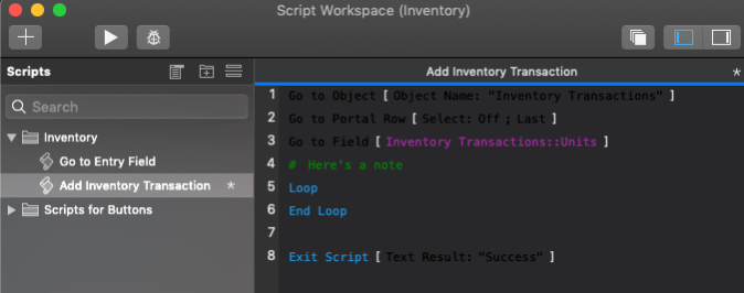
I thought though this could not be the intended effect. Had cave-dwelling developers sharpened their eyesight for dark environments? Was I hindered by spending my days in the light?
I quickly moved around my office area, closing curtains and doors to make the space as dark as possible. No glare, but no better for reading.
Second Step: Fix First Step
I checked for any plugins that could be overriding the default color choices in Script Workspace. Nope.
Time to hunt for other culprits. Found the Script Workspace Preferences under the View menu and under Syntax Coloring, selected Reset to Default.
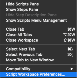
Third Step: I can see in Dark Mode!
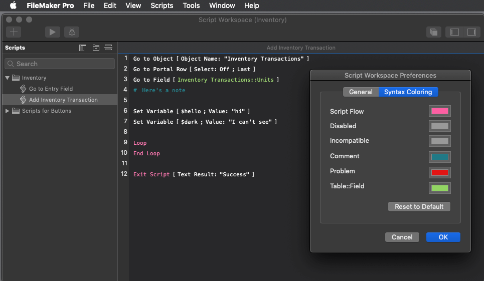
Not bad. Kind of pleasing, really.
However, by this time, my eyestrain and nerves were worse than when I began.
Fourth Step: Return to the Light Mode
FileMaker Dark Mode is not for me full time, but I’m sure I’ll use it more to change up my focus.
Some General Thoughts
Part of good development practices, of course, is knowing the work environment and preferences for the majority of users. Do they work in harsh bright light or low light offices? Perhaps there are users who are low-sighted, color-blind, or have other accessibility requirements that might benefit from Dark Mode.
Using plugins? Check with the plugin company, MonkeyBread Software, for impact in Dark Mode. For instance, MBS has a way to protect FileMaker Pro from Dark Mode.
We’ll have to wait and see if enhancements to Dark Mode support will be included in the now more frequent minor releases to the FileMaker product line.
Impact
- Layout Mode
- Dialogs and windows
- Status Toolbar
- Script Workspace
- Tooltips
No Impact
- Relationship/Query Grid (it’s really a query grid as well, isn’t it?)
- Layouts in Browse Mode other than as noted
Do you need help enhancing your FileMaker solution to better fit your work environment? We can help. Contact our team to get started.