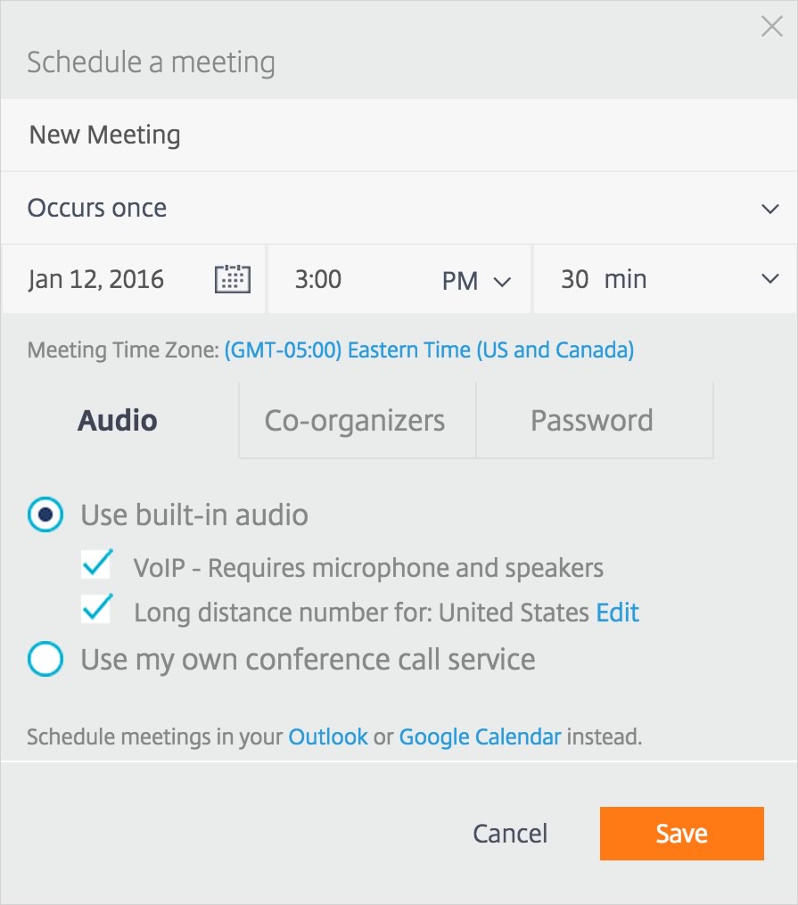
A colleague was kvetching about how annoying he finds the present flat-design of the meeting scheduling software’s interface. My first thought was, “Oh, but it’s really quite pretty… very modern looking”…
And it was followed immediately by my second thought: “Arrrgh, but there IS that one field I forget to fill out EVERY SINGLE TIME I set up a meeting, because I can’t see the field is there.”
It drives me crazy. I set up my meeting, I copy out the information, I paste it into my calendar invitation, and then I notice that I’ve yet again forgotten to put a name on the meeting. So I have to go back, edit, recopy, and repaste.
So after that little reminder, I went back and looked at the dialog in question to see if I could put my finger on just what went wrong in the design.
In the dialog, the field for the meeting title already has text in it (“New Meeting”) and it’s identical in style to the occurrence frequency field and similar in style to the dialog heading. The eye is drawn to the more obviously editable fields, the date and time fields, which have little icons on them indicating that they are fields. I skip right over the flat text fields above them, because they look more like dialog chrome that fields, and ultimately forget about them completely.

Once the meeting text is copied and pasted into some other application such as my calendar, the meeting title value is presented in bold face. Suddenly it jumps out to my eye, and I realize that I have yet again forgotten to put in a real title to replace “New Meeting.”
Flat designs – and other forms of minimalism also very popular at present – look very pretty, very modern, but sometimes go too far in stripping away design elements.
If things don’t have a visual indicator of editability or of clickability, or if the visual presentation doesn’t direct the eye immediately to the right locations, the design can fail in its primary purpose. (Spoiler: its primary purpose is NOT “look pretty.”)
So try on flat design and make super-modern styling choices, but make sure you include enough differentiation and emphasis to guide users through their tasks. Flat design and minimalism is definitely evolving in this direction. That evolution may bring us beautiful modern designs that work like gangbusters, and that makes me very happy.
Check out this UXPin blog post about a few examples of this encouraging evolution:
And a few other articles about the flat design and minimalism trends of recent years: